I often see incredible pages but If you look at the layout above very closely, you will see that the fonts and splat paints don’t follow the texture of the paper…
Is like the brushes and fonts are “stoned” without being integrated into the texture of the paper where they are applied, they looks a bit fake, almost like it’s not quite part of the page.
So here’s a little tick to add some “reality” to my brushes splats and journaling!
Blend two Layers with Blend If
Take any background you want and put Text or a Picture on it.
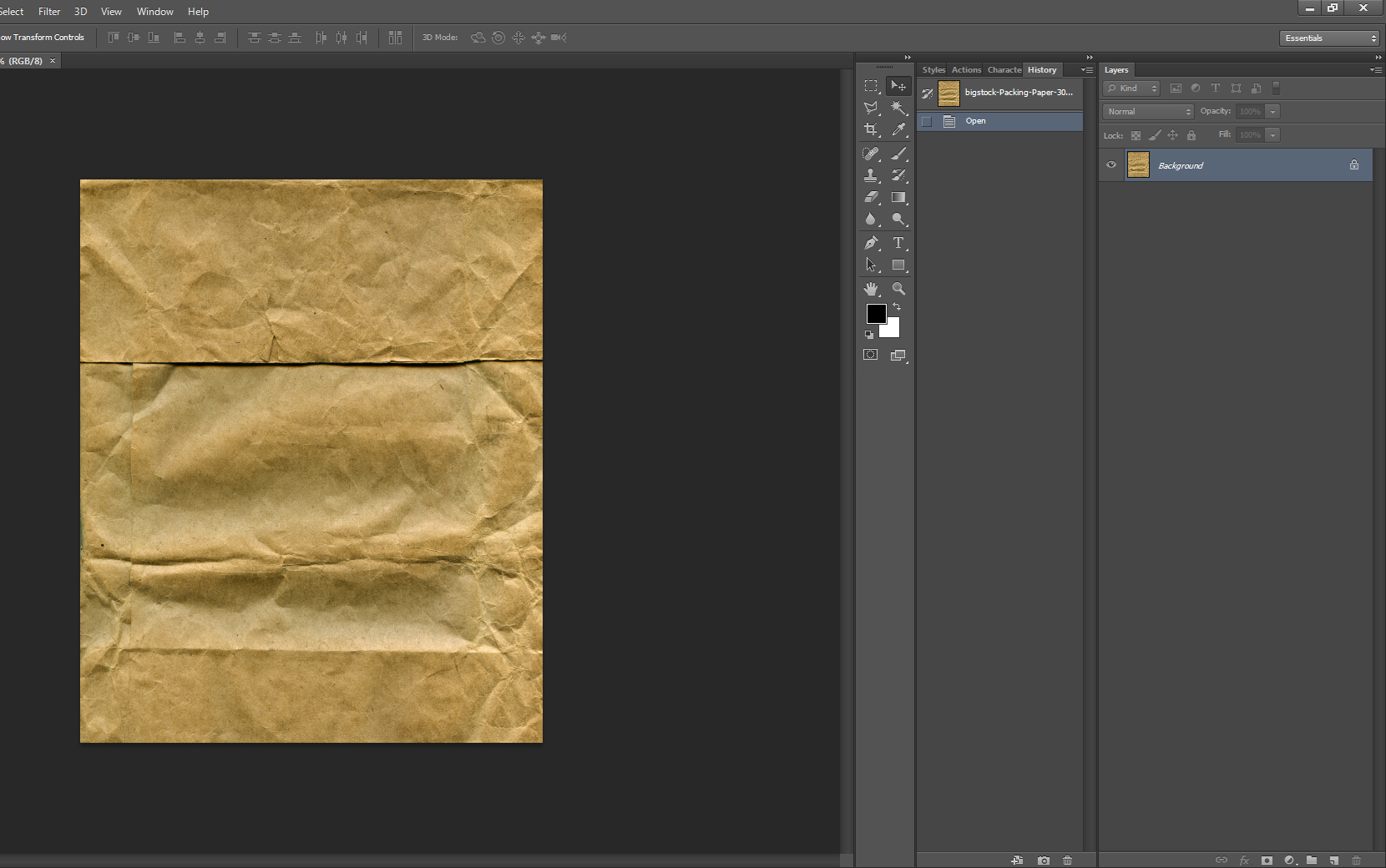
1) First I opened a crinkled kraft background to illustrate the tutorial.
2) Second I placed my text layer above the paper layer. I used a bold basic font – Cooper Black.
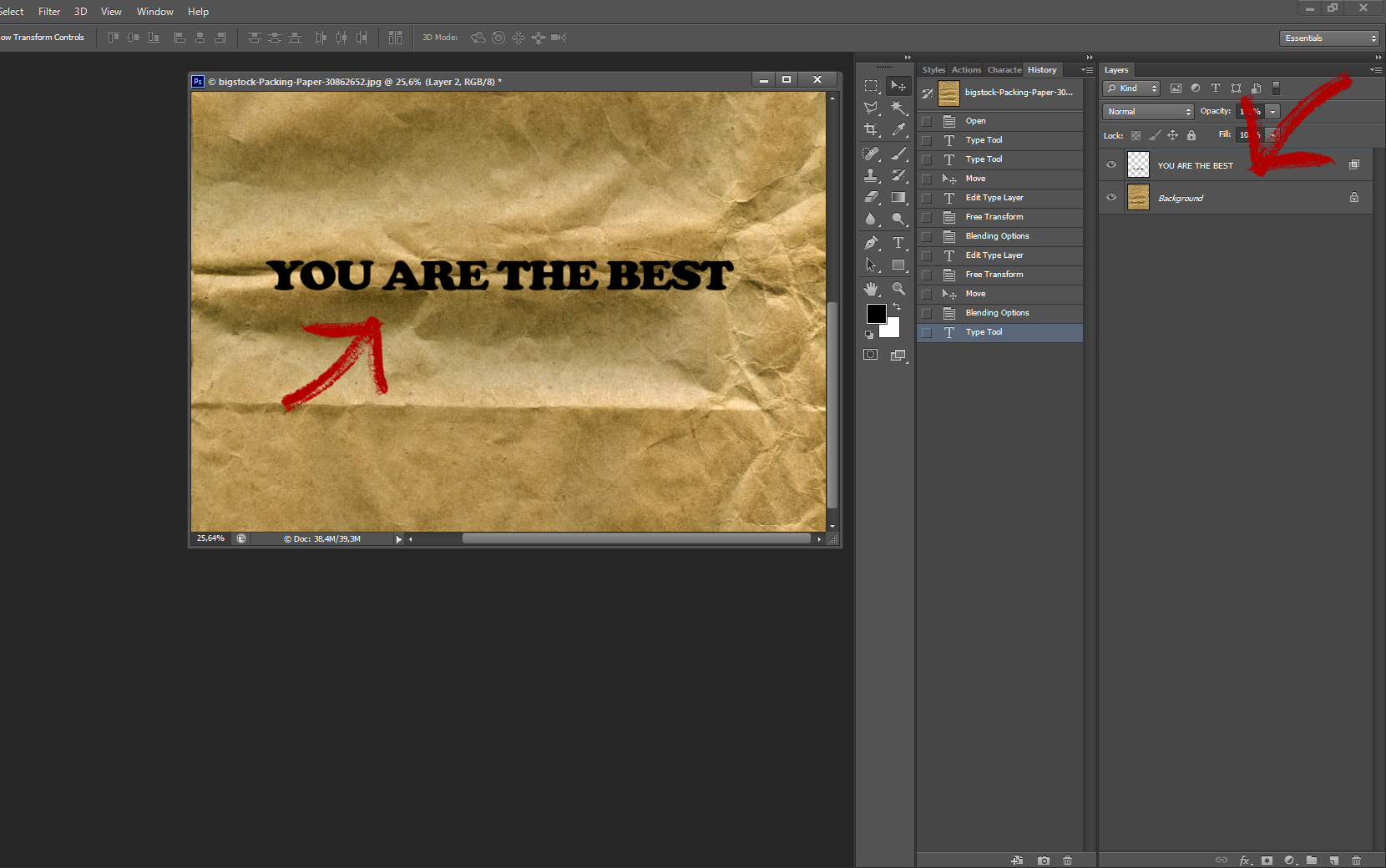
3) Now I started to play!
We need to access Photoshop’s Blending Options next, and there’s a couple of different ways to do that. We could go up to the Layer menu at the top of the screen, select Layer Style and then select Blending Options, but there’s a faster way. With the type layer selected in the Layers palette, click on the Add Layer Style icon at the bottom of the Layers palette:
 at the bottom of the Layers palette:
We’re not going to select any of the standard layer styles like Drop Shadow or Stroke here. Instead, we want the option at the very top of the list, Blending Options. Click on it to select it:
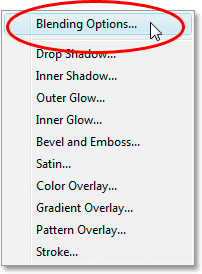
Select the Blending Options from the top of the layer styles list.
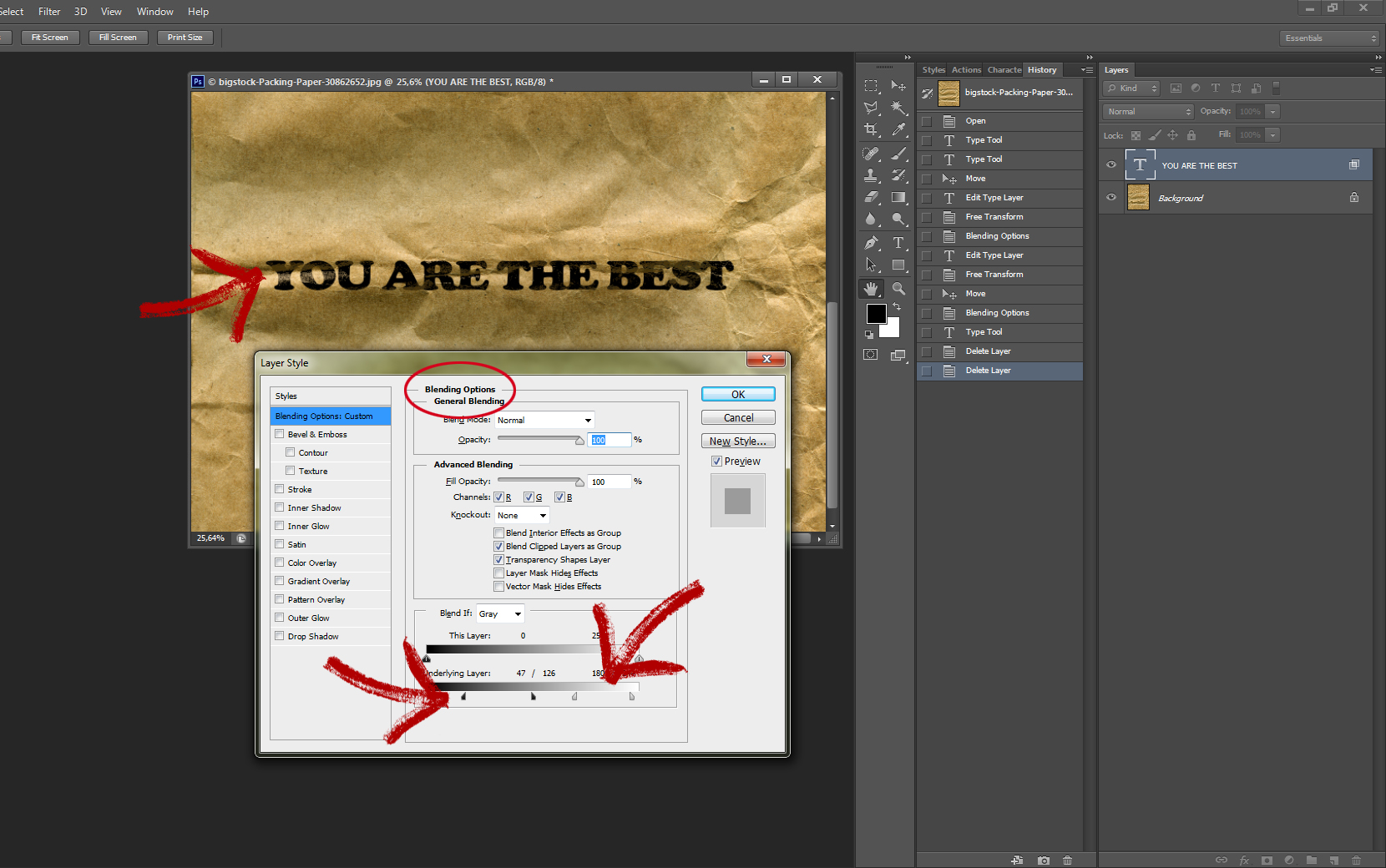
This brings up the Layer Style dialog box set to the Blending Options, and the “Blend If” sliders we’re looking for are at the very bottom:

Drag The Black And White Sliders In Towards The Center To Blend The Layers
Let’s take a closer look at the Blend If slider bars:

There’s two Blend If slider bars, and if you’re not familiar with them, you’re probably thinking they look identical, and you’d be right. They both have a gradient inside them running from black on the left to white on the right, and they both have little black and white sliders on either end. But while they both look the same, they do slightly different things.
If you look closely, you’ll see “This Layer” written above the top slider bar, and “Underlying Layer” written above the bottom one. The bar on top affects the layer you currently have selected in the Layers palette. The bottom bar is a bit misleading though because while it says “Underlying Layer”, it really affects every layer below the currently selected layer. In my case here I only have one layer, my Background layer, below my type layer, but if I had more than one layer below my type layer, it would look at all of them, not just the one.
As I mentioned, both bars may look the same, but there’s a slight difference between them. Moving the black and white sliders for the bar on top will cause areas of the currently selected layer to disappear from view. Moving the sliders for the bar on the bottom will cause areas of the layer(s) below the currently selected layer to show through the selected layer, as if it’s punching holes through the layer. In other words, since I had my type layer selected, if I move the sliders on the top bar in towards the center, I’ll be making areas in my type disappear. If I move the bottom bar’s sliders in towards the center, I’ll be making areas of my paper show through my type. Moving the white slider affects the lightest areas in the image, and moving the black slider affects the darkest areas. The further I move the sliders, the greater the tonal range that’s affected.
I want to make my type look as if it was written into the wrinkled kraft background behind it, and to do that, I need some of the paper to show through my type. Since I have my type layer selected in the Layers palette, and my crinkled kraft background is on the layer underneath it, I’m going to move the sliders on the bottom Blend If bar in towards the center to force some of the paper to show through my type. I’ll start by moving the black slider towards the center:

The darker areas and Reliefs in the crinkled kraft background are now showing through my text.
That looks pretty good already, but there’s a problem. The areas where the crinkled kraft background is showing through the type are too harsh. It’s either the text showing 100% or the paper behind it showing 100%. I need more of a subtle transition between the two to smooth things out and make it look more realistic, and I’ll do that next.
Smooth Out The Blending By Splitting The Slider Bars In Two
To smooth out the blending and create more of a transition between the two layers, I’m going to hold down the Alt(Win) / Option (Mac) key and drag the black slider back towards the left. Holding down the Alt/Option key causes the slider to split in half, as we can see here:

With the black slider now split in two, the half on the left is where the blending begins, the half on the right is where the blending reaches 100%, and the area in between is the transition area. I can now drag both halves independently of each other until I’m happy with the results.
Here’s my image after dragging the black slider to the right to force the darker parts and Reliefs of the crinkled kraft background to show through the type, then splitting the slider in two and dragging the left half of the slider back towards the left to smooth out the transition.

I’m going to do the same thing with the bottom white slider to cause some lighter areas and Reliefs in the crinkled kraft background to show through my text. First, I’ll drag the white slider to the left until I’m happy with how much of the paper is showing through:

Then I’ll hold down my Alt (Win) / Option (Mac) key to split the white slider in half and drag the right half back towards the right to create another nice transition between the two layers:

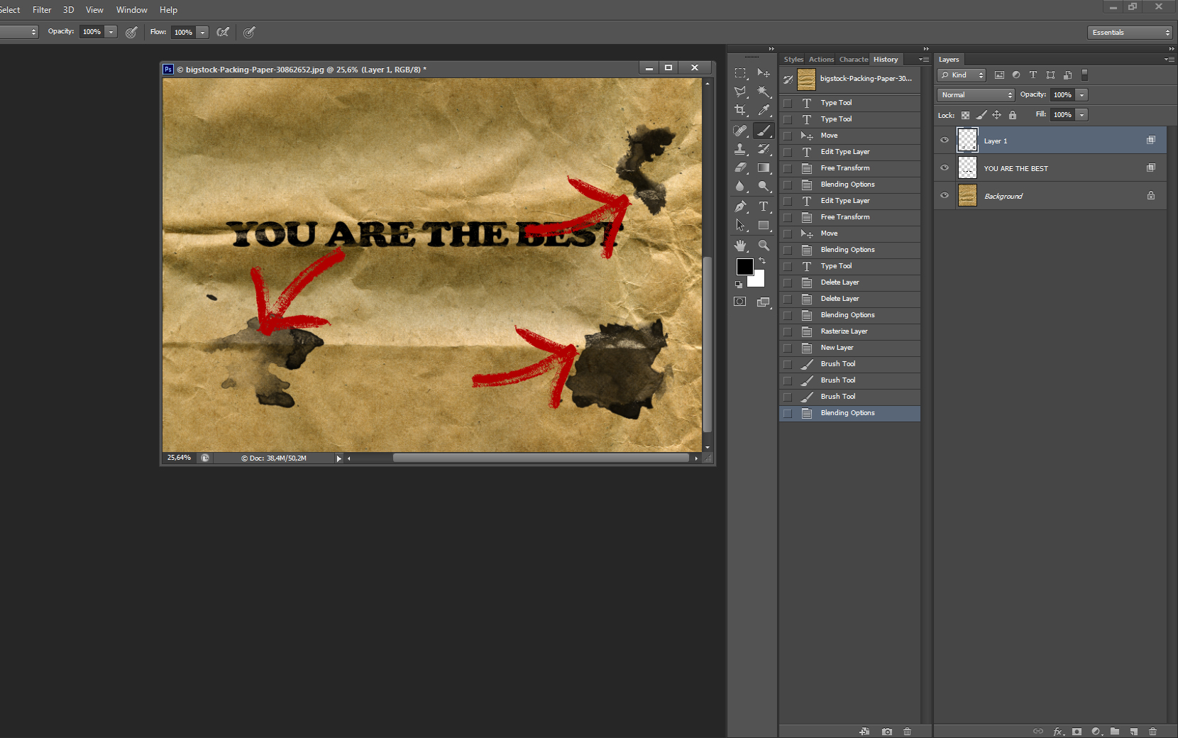
4) Now I used the same technique on some splatters!
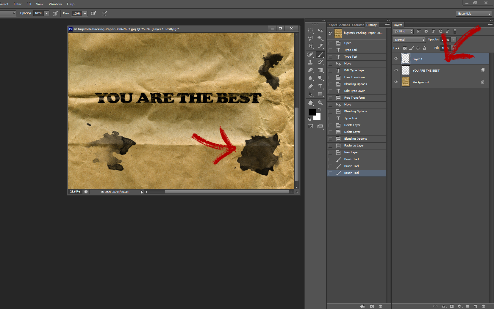
5) I just repeated all the steps of the 3) adjusting the arrows until I reached the desired effect.
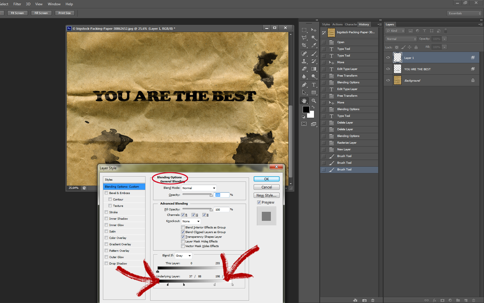
6) And “Voilá”:
I’ve moved both the black and white sliders in towards the center to force some of the crinkled kraft background to show through the type, then split the sliders in half to smooth out the transitions between the two layers.
Here’s the original image once again with my type above it before I used the Blend If sliders:

And here, thanks to Photoshop’s advanced blending options and a few simple moves of the “Blend If” sliders, is my final, much more realistic looking result:

I use it in almost everything I wrote and paint on my pages! Even on my Kits previews!
This has got to be the absolute best tutorial for ‘Blend-If’ that I have seen! Awesome!
Thank you,
Su
AWESOME and well written tutorial! I usually use blend modes and extra layers and erasing – but this is much faster and easy!! Thank You!
this is the best tutorial i have ever seen ! Very,Very helpful i will be using this on all my design work. Thank you. Tracey
Thank you for a most informative and helpful tutorial!
Great tutorial! Do YOU HAVE ANY HELP FOR US pse USERS? tHANKS AGAIN.
SORRY Diane, only saw your message today….I’ll ask for my CT to see how can they help you with the PSE!!!
xoxo
Sorry for the caps issue above. I hit the caps lock by accident.
awesome tuto, thank you Paula